Creating a recipe book is an exciting project, but to make it truly stand out, you need a cover that captures your audience's attention. A great cover can draw people in and make them eager to see what delicious recipes are inside. Here are ten of the best cover ideas for a recipe book that will help you attract more readers.
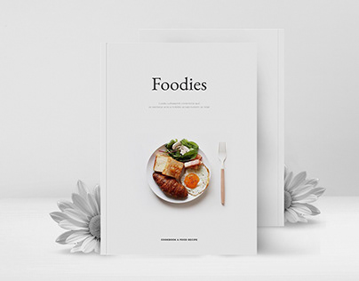
1. Minimalist Design

A minimalist cover with clean lines and simple typography can be very eye-catching. It’s elegant and makes your book look modern and sophisticated.
Why Minimalist Design Works
- Clean and Simple: No clutter, just focus on the title and a single image.
- Modern Look: Appeals to a contemporary audience.
- Versatile: Works for any type of cuisine.
Tips for Creating a Minimalist Cover
- Use one or two colors to keep it simple.
- Choose a clean, easy-to-read font.
- Use a high-quality image of a single dish or ingredient.
Extra Ideas
- Add a small logo or symbol that represents your cooking style.
- Use a textured background to add subtle interest.
- Experiment with negative space to make the title stand out.
Explore minimalist cover designs.
2. Food Photography
A beautiful photograph of a delicious dish on the cover can instantly grab attention. Make sure the image is bright, colorful, and high quality.
Why Food Photography Works
- Appetizing: Makes readers hungry just by looking at it.
- Visual Appeal: Bright and colorful images catch the eye.
- Relatable: Shows readers what they can achieve.
Tips for Using Food Photography
- Use professional-quality images.
- Choose a dish that represents the book's theme.
- Ensure good lighting to make the food look its best.
Extra Ideas
- Add garnishes or props to make the dish look even more inviting.
- Use a shallow depth of field to focus on the dish and blur the background.
- Experiment with different angles to find the most appetizing shot.
Find tips on food photography.
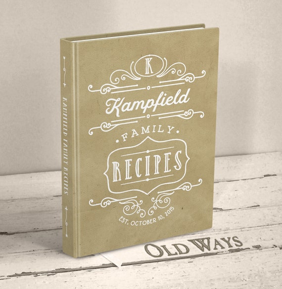
3. Rustic Charm

A rustic cover with elements like wood, burlap, and earthy colors can give your recipe book a warm and cozy feel. This style is perfect for comfort food and home cooking recipes.
Why Rustic Charm Works
- Warm and Inviting: Creates a cozy, homely vibe.
- Nostalgic: Appeals to those who love traditional cooking.
- Texture: Adds depth and interest.
Tips for Creating a Rustic Cover
- Use textures like wood or burlap in the background.
- Choose warm, earthy colors.
- Add elements like herbs or kitchen tools to complete the look.
Extra Ideas
- Include a handwritten font to give a personal touch.
- Use vintage kitchenware as props.
- Add small splashes or stains to make it look authentic and lived-in.
Learn more about rustic design.
4. Hand-Drawn Illustrations
Hand-drawn illustrations can add a unique and personal touch to your recipe book cover. This style is charming and works well for family recipes or children's cookbooks.
Why Hand-Drawn Illustrations Work
- Unique: Gives a personal and one-of-a-kind look.
- Playful: Adds a fun and whimsical touch.
- Creative: Stands out from typical photo covers.
Tips for Using Hand-Drawn Illustrations
- Use bright, cheerful colors.
- Illustrate key ingredients or dishes from your book.
- Combine illustrations with hand-lettered text.
Extra Ideas
- Create a border with small illustrations around the edge of the cover.
- Use a mix of full-color and black-and-white drawings.
- Add little notes or comments in handwriting to make it feel more personal.
Explore hand-drawn illustration ideas.
5. Classic Black and White
![]()
A black and white cover can look very elegant and sophisticated. It’s a timeless choice that works well for more serious or gourmet cookbooks.
Why Black and White Works
- Timeless: Never goes out of style.
- Elegant: Looks sophisticated and classy.
- Bold: Strong contrast catches the eye.
Tips for Creating a Black and White Cover
- Use high-contrast images or illustrations.
- Choose a bold, classic font.
- Keep the design clean and uncluttered.
Extra Ideas
- Add a pop of color with a small accent, like a title or logo.
- Use different shades of gray for added depth.
- Combine with metallic elements like gold or silver for a luxurious feel.
Find inspiration for black and white designs.
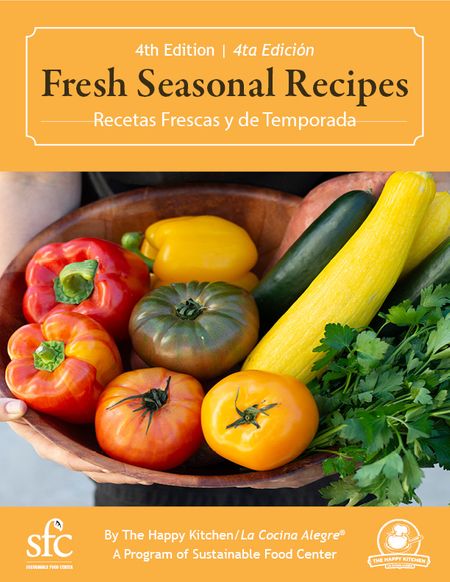
6. Seasonal Themes

A cover that reflects the season can be very appealing. Whether it’s spring, summer, fall, or winter, a seasonal theme can make your book feel timely and relevant.
Why Seasonal Themes Work
- Timely: Makes the book feel current and relevant.
- Appealing: Attracts readers looking for seasonal recipes.
- Variety: Offers endless creative possibilities.
Tips for Creating a Seasonal Cover
- Use colors and elements that reflect the season.
- Feature seasonal ingredients or dishes.
- Adjust the design to fit holidays or seasonal events.
Extra Ideas
- Change the cover for different editions based on the season.
- Use seasonal foliage or decorations as background elements.
- Incorporate seasonal fonts for typography styles.
Explore seasonal design ideas.
7. Collage Style
A collage-style cover can showcase multiple dishes or elements, giving a preview of what’s inside. This style is vibrant and full of life.
Why Collage Style Works
- Vibrant: Full of color and life.
- Informative: Gives a glimpse of multiple recipes.
- Fun: Creates an energetic and lively look.
Tips for Creating a Collage Cover
- Use high-quality images.
- Arrange the images in a balanced and appealing way.
- Include a variety of dishes to show the book’s diversity.
Extra Ideas
- Use a mix of close-ups and wide shots for variety.
- Add text overlays to highlight featured recipes.
- Create a border or frame with small images around the edge.
Get tips on creating collages.
8. Retro Design

Retro designs can give your recipe book a nostalgic feel. Think vintage fonts, old-school illustrations, and muted colors.
Why Retro Design Works
- Nostalgic: Evokes memories of the past.
- Unique: Stands out from modern designs.
- Charming: Adds a warm, inviting touch.
Tips for Creating a Retro Cover
- Use vintage fonts and colors.
- Add retro-style illustrations or photos.
- Keep the design simple and classic.
Extra Ideas
- Use a worn or distressed texture for an authentic vintage feel.
- Incorporate retro patterns like polka dots or stripes.
- Add retro kitchen gadgets or tools as decorative elements.
Find inspiration for retro designs.
9. Bold Typography
Sometimes, all you need is bold typography. A strong title with a striking font can be very effective in grabbing attention.
Why Bold Typography Works
- **Simple
**: Focuses on the title and makes it stand out. 2. Modern: Looks contemporary and fresh. 3. Eye-Catching: Grabs attention with strong text.
Tips for Using Bold Typography
- Choose a striking font that matches the book’s theme.
- Use contrasting colors for the text and background.
- Keep the design clean and focused on the text.
Extra Ideas
- Use different font weights or styles for emphasis.
- Add a textured background to make the text pop.
- Combine with a small graphic or logo for added interest.
Explore bold typography ideas.
10. Artistic Illustrations
Artistic illustrations can make your cover look like a piece of art. This style is perfect for unique and creative recipe books.
Why Artistic Illustrations Work
- Creative: Stands out with unique artwork.
- Personal: Adds a personal and artistic touch.
- Engaging: Draws readers in with beautiful illustrations.
Tips for Using Artistic Illustrations
- Use illustrations that reflect the book’s content.
- Choose colors that complement each other.
- Combine illustrations with stylish fonts.
Extra Ideas
- Create a theme for your illustrations that runs throughout the book.
- Use hand-painted or watercolor styles for a soft, artistic look.
- Combine illustrations with real photos for a mixed media effect.
Find inspiration for artistic illustrations.
These cover ideas can help you create a recipe book that not only looks amazing but also captures your audience's attention. Try out these ideas and see how they can make your book stand out. Happy designing!
